Measuring Email Performance
After you send a campaign in Oomiji, the next step is understanding how it performed.
The Measure Email Performance screen collects delivery, open, click, and engagement data for every campaign you send, giving you both an aggregate view across all sends and a detailed view of individual campaigns. This article explains how to access the performance data, how to read each of the metrics Oomiji reports, and how to turn what you see into better decisions for your next send.
Email performance data is not just reporting. In Oomiji's customer insights model, every metric is a signal about your audience: who is paying attention, what content resonates, which segments engage differently from others. The goal of reviewing performance is not to generate a report; it is to learn something you can use.
Accessing Performance Data
- Click Interaction in your toolbar.
- In the Send & Manage Emails menu, click Measure Email Performance.

The Campaign Dashboard
The Measure Email Performance screen lists every campaign you have configured, including drafts, scheduled campaigns, and sent campaigns. Each row shows the campaign name, status (Email sent or Saved as draft), recipient count, the template used, and the date sent.
A search bar lets you find a specific campaign by name. A view toggle in the upper right switches between grid view and list view. The + Create button opens the Send Email screen to start a new campaign. The Saved Reports button opens any reports you have previously saved.
Combined Reports
The checkbox next to each campaign lets you select multiple campaigns and view their performance together. You can select up to 12 campaigns at a time. This is useful for comparing performance across a newsletter series, a multi-part campaign, or any set of sends you want to analyze as a group rather than individually.
Campaign Actions
The three-dot menu at the right end of each campaign row opens three actions:
- Reports: Opens the detailed performance report for that campaign.
- Move to Folder: Moves the campaign into a folder for organization.
- View Email in Browser: Opens the rendered email in a new browser tab, useful for checking exactly what recipients received.

Individual Campaign Reports
Click the 3 dots overflow menu, then click Reports. It will take a minute or two, then load a dashboard for the selected campaign. You can save this by clicking Save Report in the upper right corner, which will speed up loading time the next time you navigate to this report.

Summary Metrics
Three donut charts at the top of the report show the headline metrics: average delivery rate, average open rate, and average click rate. These are the numbers you will glance at first to judge whether the campaign performed above or below expectations.

Event Chart
Below the summary metrics, the Event Chart is a bar chart showing every tracked event for the campaign. Events include Sent, Delivered, Open, Click, Softbounce, Hardbounce, Rejected, Complaint, and Unsubscribe. Each bar shows the event count as a percentage of total sends. This view gives you a full picture of what happened after the send, beyond just the three headline metrics.

Event Time Chart(s)
Next, keep scrolling. Next is the Event Time Chart, which plots the same nine events as lines over a date range. This shows when activity happened, not just how much. A sharp spike on send day followed by a long tail is typical; unusual patterns (such as opens continuing to climb for many days) can suggest forwarding or deliverability issues worth investigating.
A date range selector in the upper left of the chart lets you adjust the window. Click the calendar icon to change the start and end dates.
Below the combined Event Time Chart and the Click Events chart, individual line charts show Opened, Clicked, Delivered, Sent, Soft Bounce, and Hard Bounce each on their own. Each chart has its own date range selector and a download button to export the chart data. Use these when you want to focus on a single metric without the visual noise of other event lines.
Click Events (Chart View and Tabular View)
The Chart View section breaks down which specific links in your email were clicked, displayed as a pie chart. This is one of the most actionable views in the report: it tells you not just how many people clicked, but which content they cared about.


Navigate to the Tabular view to rename the URLs in the chart under the Friendly Name.
Raw URLs are often long and unreadable (for example, a full tracking link to an event page). Renaming them to something descriptive like "Event Registration" or "Referral Link" makes the chart immediately readable and useful for sharing with colleagues.

Understanding Each Metric
The metrics below are standard across the email industry, but interpreting them accurately requires context. Benchmarks vary significantly by industry, audience, and the type of email you send. The numbers that follow are general guidelines, not rules.
Delivery Rate
The percentage of emails that were successfully delivered to the recipient's inbox provider. This does not mean the email reached the inbox (it could have landed in spam); it means the receiving server accepted the email. Delivery rate is calculated as emails delivered divided by emails sent.
A healthy delivery rate is 97 percent or higher. Anything below 95 percent is a warning sign. If your delivery rate is low, the most common causes are: a stale contact list with outdated or fake email addresses, a sender reputation problem (often caused by previous spam complaints), or a misconfigured Mailing Suite Profile with incomplete authentication.
If you see a delivery rate drop, check your bounce rate first. A high bounce rate usually explains a low delivery rate. If bounces are normal but delivery is still low, investigate whether your sending domain has been flagged by major email providers.
Open Rate
The percentage of delivered emails that were opened by the recipient. This is the most commonly cited email metric, and also the most misleading one in 2026.
Historically, open rates were tracked using a tiny invisible image in the email. When the recipient's email client loaded the image, the open was recorded. This worked reasonably well until Apple introduced Mail Privacy Protection (MPP) in 2021. MPP pre-loads tracking images for all Apple Mail users automatically, which means every email sent to an Apple Mail user registers as opened whether or not the recipient actually looked at it.
As of 2026, somewhere between 40 and 60 percent of email users are on Apple Mail. This means open rates are inflated by a substantial and unpredictable amount. An open rate of 50 percent today does not mean the same thing it meant in 2020. Use open rates for comparison across your own campaigns (the inflation is roughly consistent across your sends), but do not treat them as a measure of actual attention.
When comparing to benchmarks: a typical open rate across industries in 2026 is between 30 and 45 percent. A rate below 25 percent suggests a subject line problem, a deliverability issue (emails going to spam), or an audience that is not engaged with your content. A rate above 50 percent is good but should be interpreted with MPP inflation in mind.
Click Rate
The percentage of delivered emails where the recipient clicked a link inside the email. Unlike open rate, click rate is not distorted by MPP. A click is a real action taken by a real person, which makes it the most trustworthy engagement metric in modern email.
Click rate is always much lower than open rate because it requires more effort from the recipient. A typical click rate across industries is between 2 and 5 percent. A rate above 5 percent is strong. A rate below 1 percent suggests that your content is not driving action, or that your call to action is unclear or absent.
If you are trying to improve click rates, focus on making the call to action prominent (a button instead of a text link), reducing the number of competing links in the email (one primary call to action outperforms three or four competing ones), and making the value of clicking clear and specific. The Click Events pie chart in the report shows which links actually got clicked, which tells you what your audience responded to.
Soft Bounce and Hard Bounce
Oomiji tracks bounces as two distinct event types. Understanding the difference matters because the two have different implications.
A soft bounce is a temporary delivery failure: the mailbox was full, the server was temporarily down, or the message was too large. Soft bounces often resolve on the next send and do not require action.
A hard bounce is a permanent delivery failure: the email address does not exist, the domain is invalid, or the mailbox has been permanently closed. Hard bounces indicate an address that will never accept mail and should be removed from your list. A healthy combined bounce rate is under 2 percent. A consistently higher bounce rate usually means your contact list includes old or inaccurate addresses and will eventually damage your sender reputation.
Hard bounces are automatically removed from your sending list. Oomiji suppresses hard-bounced addresses so they are not included in future sends.
Rejected and Complaint
Rejected events occur when a receiving server refuses the email entirely, often because of spam filtering or reputation issues. Complaint events occur when a recipient clicks the "mark as spam" button in their email client. Both are signals that your sending reputation or content may be triggering filters.
A small number of complaints is unavoidable. A spike is a warning sign that something about a specific campaign (frequency, subject line, content, or audience targeting) triggered a stronger-than-usual negative response.
Unsubscribe Rate
The percentage of recipients who clicked the unsubscribe link after receiving the campaign. Some unsubscribes are inevitable and healthy; they represent people leaving your list on their own terms rather than marking you as spam.
A typical unsubscribe rate is under 0.5 percent per campaign. A sudden spike in unsubscribes from a specific campaign is a strong signal that something about that send did not match audience expectations: the content was off-topic, the frequency felt too high, or the subject line felt misleading. Investigate spikes rather than ignoring them, because the people who clicked unsubscribe are usually a small fraction of the people who felt the same way.
Unsubscribed contacts are automatically added to your suppression list and excluded from all future sends. See Setting Up Your Unsubscribe Link for details on how the unsubscribe flow works.
Filtering by Segment
The Segments dropdown, all the way at the top of your screen, is one of the most powerful features on this screen. It lets you see how the campaign performed among a specific group of contacts rather than the full recipient list.
You can select any existing segment, create a new segment from this campaign's contacts, or view all contacts (the default).
Segments built here work a little differently from segments built in your Database. Campaign reports are generated on-the-fly from your event data, while your Database stores contact records directly.
Use segment filtering to answer questions like: Did my top-tier customers engage differently than my general list? Did the segment I targeted this campaign toward outperform the rest? Are new contacts clicking through at the same rate as long-term contacts? Segment-level performance data often tells you more than the aggregate number, because averages hide the differences between groups.
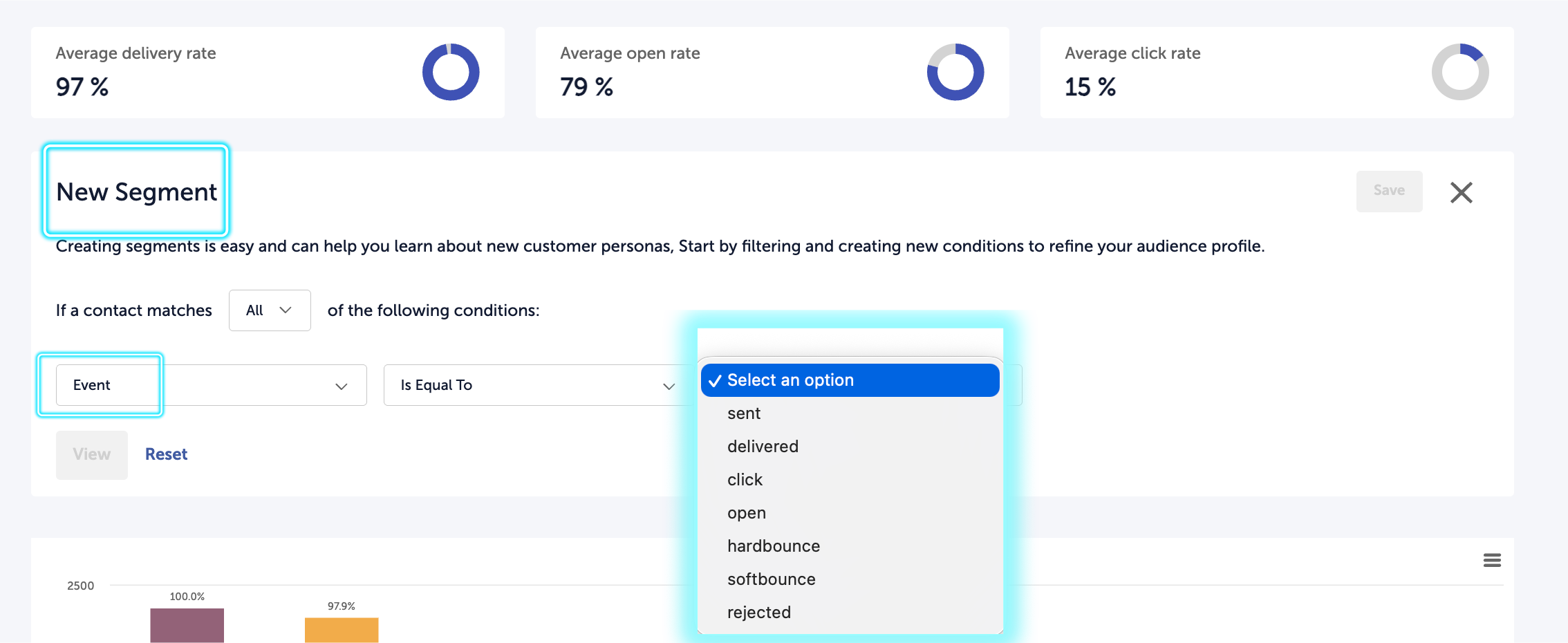
One practical use is building a segment of contacts who clicked a specific link in your campaign.
From the Segments dropdown, select Create New Segment. In the segment builder, set the first condition field to Event, the operator to Is Equal To, and the value to click. A fourth field will appear letting you select the specific link. Choose the link you want, then click View to see which contacts clicked it. You can then save that segment and use it elsewhere in the platform, including as a recipient list for a follow-up campaign.
Comparing Campaigns to Each Other
A single campaign's metrics mean very little in isolation. The most useful question is not "is this open rate good?" but "is this open rate good compared to what I usually see?" Use the combined report feature (selecting up to 12 campaigns from the dashboard) to view multiple sends side by side.
When a campaign under-performs your baseline, the question becomes: what was different? Common variables worth investigating:
- Subject line: Did you try something new? Did it work? Over time, you build a library of subject line patterns that work for your audience.
- Send time: Different times of day and days of the week produce different results. A slow mid-week send may out-perform a Monday morning blast, or vice versa, depending on your audience.
- Audience segment: A campaign sent to a narrowly targeted segment usually outperforms one sent to your full contact list, because the content is more relevant to the people receiving it.
- Content format: Long emails, short emails, plain text, image-heavy layouts, and single-purpose versus round-up content all perform differently. Your audience has preferences you can learn only by comparing results across different formats.
Using Performance Data to Improve
The point of measuring is not to generate reports. It is to change what you do next. A useful habit is to review each campaign within a week of sending, note one thing that performed better or worse than expected, and identify one change you will try in the next send. Small, systematic experimentation over many campaigns produces far better results than sporadic major redesigns.
Keep a simple running log: which subject lines performed best, which send times worked for which audiences, which content formats drove the highest click rates. Over time, this log becomes more valuable than the raw metrics themselves, because it tells you what you have already learned about your specific audience.
Performance Data as Customer Insight
Email metrics are most powerful when you stop thinking of them as campaign reports and start thinking of them as data about your audience. A high click rate on a specific topic tells you what your contacts care about. A low open rate on a segment tells you that segment is either disengaged or mis-targeted. A spike in unsubscribes after a specific message tells you where your content crossed a line for part of your audience.
This data feeds back into the rest of the platform. If a segment is consistently under-engaged, that is a signal to revisit the segment definition or the content you send them. If a specific topic consistently drives high engagement, that is a signal to build more campaigns around it and to ask follow-up questions through Insights conversations. The loop between sending, measuring, and refining is what turns email from a broadcast channel into a learning channel.
This is the distinction between using an email tool and using a customer insights platform. An email tool shows you who opened what. An insights platform helps you understand what that behavior means and what to do about it. Oomiji's performance data is designed to support the second use, not just the first.
What's Next
- To send a follow-up to contacts who did not open your campaign, see Resending an Email to Non-Openers.
- To build segments that you can compare performance across, see Building and Managing Segments.
- To ask your audience follow-up questions based on what you learn from the metrics, see Creating and Configuring Conversations and Embedding a Conversation Question in Email.
- To manage your suppression list and review recipients who have unsubscribed, see Manage Your Suppression List.